end-users > Search > The criteria search
The criteria search
Presentation
The “criteria search” serves as the primary tool available to end-users in the AMI ecosystem. It consists of several search interfaces configured by an administrator, enabling end-users to select various types of data based on some criteria of their choice. Access to the search interfaces can be found in the menu under Search > Search.
Categories and interface names
When the end-user opens the “Search” web application, categories of interfaces appear as blue badges in the upper left corner. Next to each category badge, gray search name badges are clickable, allowing end-users to access the desired search interface (see Fig. 1).
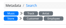
Figure 1. Categories and search interface names
Please note that it is the responsibility of the administrator to name the search interface in a way that is easily understandable for the end-users.
Search interfaces
Overview
Selecting a search interface by clicking on a gray badge will open the desired search interface within a tab system, as illustrated in Figure 2.
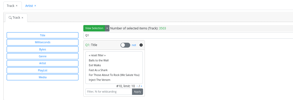
Figure 2. Opening criteria search interfaces
End-users can open or close several search interfaces that will be accessible within the tab system.
All search interfaces offer the same primary functionalities:
- Criterion list: A list of selectable criteria appears on the left side as clickable blue buttons. Clicking on a button will open a criterion box that allows the end-user to refine the data selection.
- Criterion boxes: Criterion boxes may appear by default, with preselected values or not, depending on the configuration set by an administrator. Alternatively, end-users can open them by clicking on a criterion blue button in the criterion list. Criterion boxes interact with each other: selecting a value in a given box can make the other boxes update their possible criteria values accordingly. Criterion boxes may have different appearances depending on the criterion type (text, number, boolean, etc.), as described in next sections.
- View selection button: A “big green button” allows the end-user to view the selection once their criteria are selected. A green number is displayed near this button to show the number of currently selected items corresponding to the selected criteria.
Text criterion box
There are two sub-types of text criterion boxes depending on the size of the set of possible values, which is configured by an administrator.
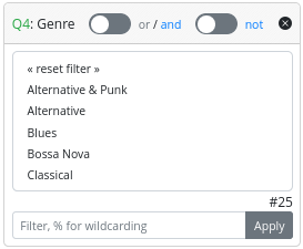 Figure 3. Text criterion box (few) | 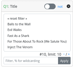 Figure 4. Text criterion box (many) |
Text (few) (see Fig.3): This box consists of three parts:
- Header: In this section the end-user can see from left to right:
- The criterion box ID: Letter Q plus an integer
- The name of the corresponding criterion
- An “or/and” switch, allowing the selection of multiple criterion values, and specifying whether the search should include items corresponding to all selected criteria values or at least one of them.
- A “not” switch, allowing the search to be conducted considering the selected values or their complementary set.
- A “x” close button to close the criterion box.
- Main: A list of multi-selectable criterion text values.
- Footer:
- The number of possible values for the criterion, indicated as # plus a number.
- A filter to select possible values based on a filter value. To apply a filter, the end-user must type a filter value in the text field and click the “apply” button.
Text (many) (see Fig.4): This box is composed of three parts:
- Header: In this section the end-user can see from left to right:
- The criterion box ID: Letter Q plus an integer.
- The name of the corresponding criterion.
- A “not” switch, allowing the search to be conducted considering the selected criterion values or their complementary set.
- A “x” close button to close the criterion box.
- Main: A list of multi-selectable criterion text values. As there are many values, only the first ten are displayed.
- Footer:
- A navigation tool to display ten more possible values or ten fewer possible values.
- A filter to select possible values based on a filter value. To apply a filter, the end-user must type a filter value in the text field and click the “apply” button.
Number criterion box
This box is displayed as shown in Figure 5:
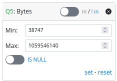
Figure 5. Number criterion box
The number criterion box consists of three parts:
- Header: In this section the end-user can see from left to right:
- The criterion box ID: Letter Q plus an integer.
- The name of the corresponding criterion.
- An “in/!in” switch, which allows the search to consider items with criterion values within the Min and Max value range or outside of it.
- A “x” close button to close the criterion box.
- Main: In this section, the end-users can select a range of criterion possible values
- A “Min” text field allows the definition of the minimum value of the range.
- A “Min” text field allows the definition of the maximum value of the range.
- An “IS NULL” switch allows the end-user to specify if the search should include NULL values for this criterion. If selected, Min and Max values are not taken into account.
- Footer:
- A “set” link to apply the update on the current criterion selection to the entire search.
- A “reset” link to reset “Max,” “Min,” and the “IS NULL” switch to their default values.
Boolean criterion box
This is displayed as shown in Figure 6:
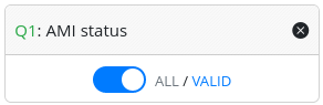
Figure 6. Boolean criterion box
The number criterion box consists of two parts:
-
Header: In this section the end-user can see from left to right:
- The criterion box ID: Letter Q plus an integer.
- The name of the corresponding criterion.
- A “x” close button to close the criterion box.
-
Main:
- A “switch” allowing end-users to choose between two possible values. The boolean criterion box has two modes that can be configured by an administrator. In the first mode, the end-user can select all the possible criterion value or a specific value. In the second mode, the end-user can select a specific value or another specific value (e.g., true/false).
Key/Value criterion box
The Key/Value criterion box is similar to the text criterion box and corresponds to a JSON dictionary stored in the database. There are two sub-types of Key/Value criterion boxes depending on the size of the set of possible values, which can be configured by an administrator.
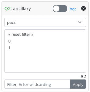 Figure 7. Key/Value criterion box (few) | 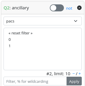 Figure 8. Key/Value criterion box (many) |
Key/Value (few) (see Fig.3): This box consists of three parts:
- Header: In this section the end-user can see from left to right:
- The criterion box ID: Letter Q plus an integer
- The name of the corresponding criterion
- An “or/and” switch, allowing the selection of multiple criterion values, and specifying whether the search should include items corresponding to all selected criterion values or at least one of them.
- A “not” switch, allowing the search to be conducted considering the selected values or their complementary set.
- A “x” close button to close the criterion box.
- Main:
- A drop-down list corresponding to possible keys. Selecting a key will display the corresponding possible criterion values.
- A list of multi-selectable criterion text values that appear when a key is selected.
- Footer:
- The number of possible values for the criterion, indicated as # plus a number.
- A filter to select possible values based on a filter value. To apply a filter, the end-user must type a filter value in the text field and click the “apply” button.
Key/Value (many) (see Fig.4): This box is composed of three parts:
- Header: In this section the end-user can see from left to right:
- The criterion box ID: Letter Q plus an integer.
- The name of the corresponding criterion.
- A “not” switch, allowing the search to be conducted considering the selected criterion values or their complementary set.
- A “x” close button to close the criterion box.
- Main:
- A drop-down list corresponding to possible keys. Selecting a key will shows the corresponding possible criterion values.
- A list of multi-selectable criterion text values that appear when a key is selected. As there are many values, only the first ten are displayed.
- Footer:
- The number of possible values for the criterion, indicated as # plus a number.
- A navigation tool to display ten more possible values or ten fewer possible values.
- A filter to select possible values based on a filter value. To apply a filter, the end-user must type a filter value in the text field and click the “apply” button.
Criterion boxes behavior
The possible values displayed in a criterion box can refresh based on other selected values in another criterion box. Sometimes, it may occur that a value initially selected within a box for a criterion no longer applies to the set of global result items.
In this case, the criterion value will appear written in red, as shown in Figure 9:
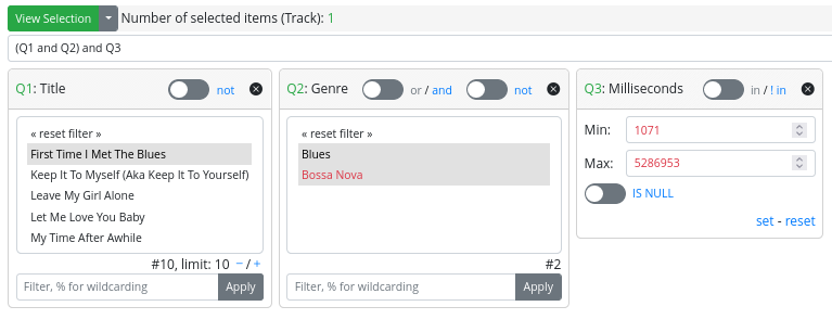
Figure 9. Useless criterion value
This indicates that the value was selected by the end-user at the application level, but it is now considered useless, as the global selection result will be the same without it.
Please note:
- Unselecting a red value in a criterion text box or key/value box will simply make it disappear from the list of possible values.
- Clicking reset on a criterion number box with red “Max” or “Min” values will make the box readjust to the appropriate range.
Displaying a selection
Once all the desired criteria are set through the criterion boxes, users can view the resulting selection by clicking on the big green button “View Selection”. This will open a new tab where displaying the result.
Result table
The results are presented using the generic AMI ecosystem table component. Essentially, this is a table enriched with mini-tools for ordering, filtering, etc., as illustrated in Figure 10. This table can be fully configured by an administrator. Furthermore, the table component is designed to facilitate easy navigation between linked entities of a result item.
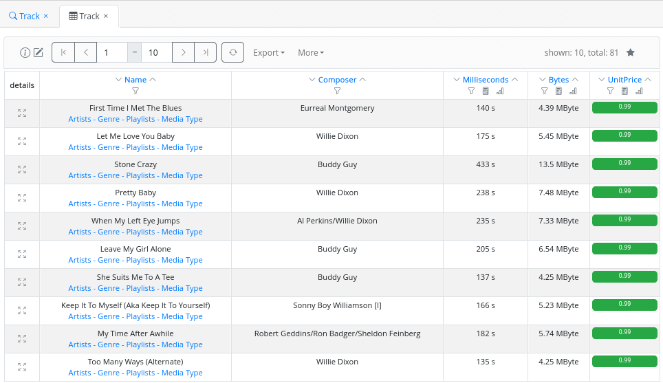
Figure 10. Displaying search result
Navigation bar
The navigation bar, as shown in Figure 11, offers several features: information, navigation, custom refining, export, bookmarks…

Figure 11. Search result navigation bar
From left to right, an end-user can find:
Information tool
Edit tool
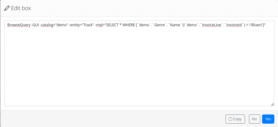
Figure 12. Editing the current command
Navigation
By default, the results are paginated by 10 entries. The navigation bar offers a tool to navigate to different pages of results or to change the range of results to be displayed (see Figure 13). To apply the changes made and refresh the result display, an end-user has to click on the refresh button.

Figure 13. Navigating through the results
Export menu
The export menu allows end-users to export the results in various file formats (XML, JSON, CSV, and Text) as shown in Figure 14. This feature should be used with caution, especially for results with a large number of records…
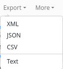
Figure 14. Exporting the results
More menu
Miscellaneous features are grouped there (see Figure 15):
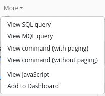
Figure 15. Miscellaneous features
- View SQL query: Display the query generated by AMI ecosystem that is effectively executed on the database server.
- View MQL query: Display the MQL query corresponding to the current selection.
- View command (with paging): Display the command used by the ecosystem to get one page of results. This could be useful for end-users who want to use the AMI ecosystem in scripts.
- View command (without paging): Display the command used by the ecosystem to get all the results. This could be useful for end-users who want to use the AMI ecosystem in scripts.
- View javascript: Display the JavaScript code to add to an HTML page to embed the table component in it. This is useful if one wants to display results on a custom page like wiki pages.
- Add to dashboard: Allow adding the AMI ecosystem table corresponding to the current search to the user dashboard. Existing dashboards of end-users appear at the top of the page as a speedometer icon drop-down menu near the login. They can be accessed/edited from there, as shown in Figure 16.
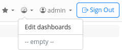
Figure 16. Viewing/Editing dashboards
Result stats
On the right, two numbers are displayed: “shown” is the number of records currently viewable on the page, “total” is the total number of records corresponding to the search criteria.
Bookmark
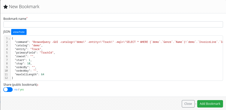
Figure 16. Bookmarking a search result
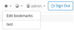
Figure 18. Editing/viewing bookmarks
Mini-tools
At the top of each field column, an end-user has access to mini-tools to further refine or order the selection. These tools can be identified by their icon symbols:
Sorting
Filtering
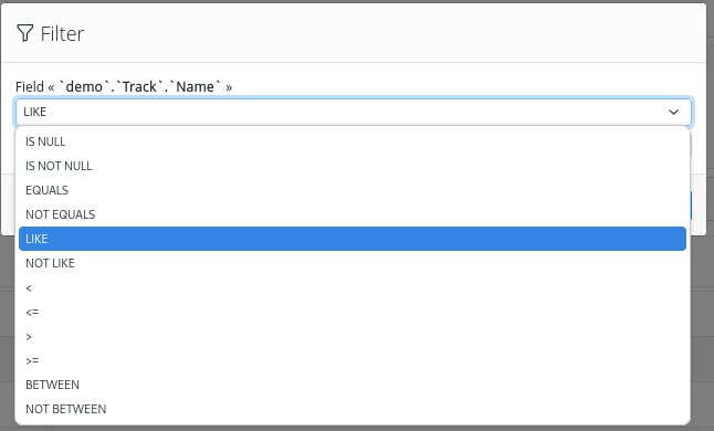
Figure 19. Filtering by field values
Statistics
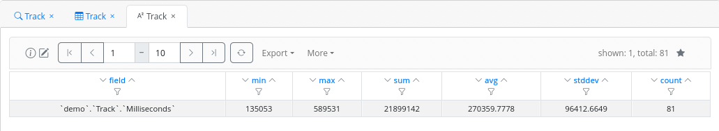
Figure 20. Viewing stats by field
Histograms
Grouping by value
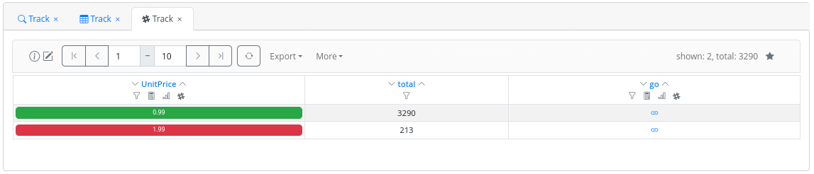
Figure 21. Grouping by field value
Unit editor
An administrator has the capability to configure certain fields so that end-users can display numeric values in an appropriate unit, rather than showing the raw value. End-users can set the unit by clicking on the value, which will open a modal, as shown Figure 22 where the display unit can be changed.
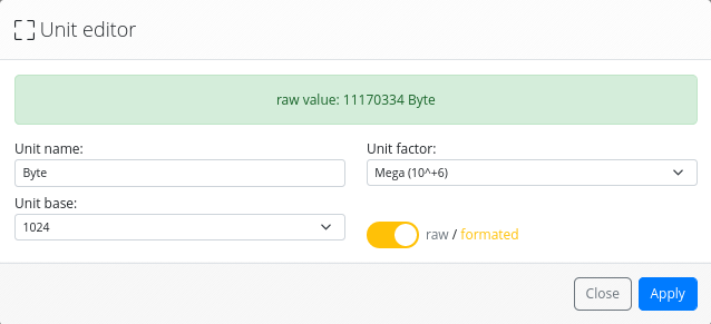
Figure 22. Unit Editor
Colored values
An administrator has the capability to configure certain fields to display in different colors in the results table, based on the field value. For instance, in Figure 21, green corresponds to a track unit price less than or equal to 1.00€, while red is used for tracks with a unit price greater than 1.00€.
Web-links
Web links may appear beneath certain field values, as shown in Figure 23. These links enable users to navigate to other metadata associated with the specific record. This additional metadata could be related to other entities within the same database or may be part of an external system.

Figure 23. Web links
These links are configured by an administrator using the schema viewer tool.
Details view
Each line in the result table begins with a “details” button. Clicking on it will open a new tab, providing all the information known to the AMI ecosystem about the specific record. This information is displayed using the AMI ecosystem’s “Element Info” component, as shown in Figure 24.
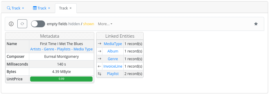
Figure 24. Element Info
At the top, similar to the table component, a toolbar allows the end-user to obtain information about the current catalog in use or bookmark this detailed view.
With the Element Info view, a user can access field information that may not be displayed within the table component by default, especially if the field was not configured to do so by an administrator. From this view, an end-user can also see what other entities are linked with the current entity record and navigate through them.
- Prev
- The search modeler